¿Qué pasaría si la persuasión no se sintiera como presión?
La mayoría de las páginas de producto se esfuerzan demasiado. Ventanas emergentes de urgencia. Temporizadores de cuenta regresiva. Afirmaciones de escasez. Su objetivo es "convertir", pero a menudo fracasan, dejando a los usuarios escépticos, molestos y emocionalmente cerrados. No es que la gente odie comprar. Simplemente odia sentirse manipulada.
Este artículo explora cómo diseñar páginas de producto de comercio electrónico que generen confianza, claridad y una psicología sutil, no presión. Analizaremos qué es lo que realmente genera credibilidad a largo plazo, las microdecisiones que aumentan la facilidad y la confianza, y cómo estructurar páginas que guíen en lugar de presionar.
Conclusiones prácticas
- Replantear el valor a través de la ganancia proyectada:Muestra cómo es la vida con su producto, no lo que pierden sin él.
- Anclar emocionalmente, no dramáticamente:Utilice elementos visuales, textos y diseño para evocar confianza, curiosidad o alivio.
- Utilice microinteracciones para reducir la fricciónLos efectos de desplazamiento, las imágenes a escala y los botones fáciles de usar facilitan la toma de decisiones.
- Evite la falsa urgencia:Reemplace las cuentas regresivas con pruebas sociales y señales auténticas de demanda.
- Pruebe la intención de comportamiento, no los clics vanidosos:Céntrese en los resultados A/B vinculados a CVR, mapas de calor de desplazamiento y puntos de vacilación.
- Diseño para la facilidad cognitivaLos diseños escaneables, las etiquetas consistentes y la jerarquía visual reducen la carga mental.
Personalizar éticamente:Ofrezca relevancia sin vigilancia, informe a los usuarios por qué Están viendo lo que ven.
¿Quieres ayuda para aplicar esto a tu negocio? Hablemos en Escalera Infinita LLC.
Hemos exagerado nuestras cartas
Durante años, los profesionales del marketing digital trataron las páginas de producto como mesas de póker, repletas de trucos, señales y tensión. Descuentos llamativos, relojes de cuenta regresiva, insignias falsas de escasez. La idea era simple: acorralar al usuario para que compre. Pero aquí está el problema: los usuarios aprendieron el juego. Y una vez que saben que les están tomando el pelo, se retiran.
En 2025, la temperatura emocional de las compras en línea ha cambiado. La gente no quiere que la convenzan, quiere que la comprendan. Navegan con recelo, no con curiosidad. Son hábiles en la manipulación: la urgencia parece falsa, los testimonios parecen escenificados y las llamadas a la acción se leen como exigencias. Las redes sociales están inundadas de publicaciones como... “Siento que cada página de producto me grita que haga algo que no pedí”. No es sólo ruido, es desconfianza.
Esto no es solo anecdótico. Estudios demuestran que la falsa urgencia reduce la intención de compra hasta en un 491% y que el 841% de los compradores abandonan las interfaces demasiado insistentes. El cliente no se resiste a la oferta, sino a la sensación de estar siendo presionado.
Necesitamos un nuevo paradigma. Uno que no se exceda, sino que invite a los usuarios a jugar.
La ciencia de la facilidad
Cuando las decisiones parecen fáciles, parecen correctas. No es una metáfora, es ciencia cognitiva. Los investigadores lo llaman... fluidezLa preferencia del cerebro por cosas fáciles de entender, visualmente coherentes y emocionalmente inofensivas. En las páginas de producto, esto se traduce en jerarquías claras, texto legible y microinteracciones que guían sin abrumar.
Piense en la atención del usuario como si fuera agua: fluye donde encuentra menos resistencia. Cuando los botones están ocultos, las especificaciones se esconden tras pestañas o los diseños obligan a realizar demasiadas comparaciones, se genera fricción. Se instala la fatiga de decisión. El usuario rebota.
Ahora, compara eso con una página que te da la bienvenida con una imagen tranquilizadora, un precio claro, una llamada a la acción obvia y un desplazamiento intuitivo. Sin trucos. Solo claridad. En las pruebas A/B, incluso pequeños cambios, como subir las reseñas a una posición más alta en la página o aclarar los gastos de envío al principio, pueden aumentar las conversiones en dos dígitos. Porque cuando los usuarios no tienen que esforzarse para comprender, son libres de elegir.
El diseño no consiste en eliminar el pensamiento. Se trata de eliminar el esfuerzo inadecuado.
La confianza como detonante: diseñar con anclas emocionales
La confianza no es una característica. Es un sentimiento silencioso, acumulativo y poderoso. No surge como la urgencia. Se instala como la certeza. Y las mejores páginas de producto no la fabrican, sino que la diseñan para ella.
¿Cómo? Anclando las emociones que los usuarios ya desean sentir: alivio, cuando ven políticas de devolución claras; curiosidad, inspirado en una historia honesta detrás de la marca; validación, a través de fotos reales y reseñas que no parecen improvisadas. Incluso el diseño influye. Cuando las especificaciones son fáciles de leer y la llamada a la acción no llama la atención, sino que simplemente... invita, la página dice: Respetamos tu proceso.
Esto no es sentimentalismo superficial, sino experiencia de usuario estratégica. Los análisis de comportamiento muestran que los usuarios interactúan más tiempo y hacen clic con más profundidad cuando una página evoca estados emocionales positivos. De hecho, las páginas diseñadas con principios narrativos como... Arquetipo de guía (“estamos aquí para ayudarlo a prosperar”) superan consistentemente los diseños basados en la escasez tanto en tiempo en la página como en visitas repetidas.
En el mundo del comercio electrónico, la confianza es la nueva urgencia. Y, a diferencia de los plazos, se consolida con el tiempo.
¿Quieres diseñar páginas de productos que generen confianza y conviertan mucho después del primer clic? Construyámoslo juntos en Escalera Infinita LLC.
La ventaja ética: persuasión sin manipulación
La diferencia entre la persuasión y la manipulación es el respeto. Uno guía; el otro, acorrala. Uno construye alineamiento; el otro explota la fricción. Y en una economía digital donde los usuarios pasan por alto 10,000 estímulos al día, esa diferencia lo es todo.
Demasiadas marcas aún recurren a tácticas de presión encubiertas en la experiencia de usuario: tarifas sorpresa, urgencia engañosa y testimonios exagerados. Estas tácticas no solo son molestas, sino que erosionan la confianza. Los datos son claros: las interacciones forzadas (como formularios obligatorios para clientes potenciales o superposiciones agresivas) aumentan las tasas de rebote y perjudican el recuerdo de marca. Y, sin embargo, algunos todavía preguntan: “¿Pero se convierte?” La mejor pregunta es: “¿Cuánto te cuesta?”
La persuasión ética cambia el guion. Respeta la autonomía del comprador. Utiliza la ciencia del comportamiento no para manipular las decisiones, sino para... reducir la fricción y aumentar la claridad. Como un GPS que no te dice dónde girar, pero hace que el camino parezca obvio.
Y aquí está la ironía: cuando dejas de forzar la venta, creas las condiciones para que esta se produzca de forma natural. Porque la confianza no empuja, sino que atrae.
Pequeños cambios, grandes transformaciones: un plan práctico
La conversión no siempre proviene de la reinvención, sino a menudo del refinamiento. Las optimizaciones más potentes rara vez son drásticas. Son sutiles, casi invisibles para el ojo inexperto. Pero para el usuario, representan un alivio.
Aquí está el plano:
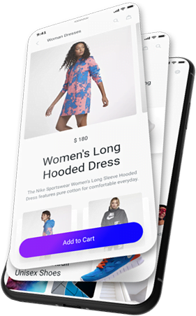
- CTA pegajososEspecialmente en dispositivos móviles, donde el alcance del pulgar lo es todo. Un botón flotante de "Añadir al carrito" aumentó el CVR en 18% en una prueba A/B reciente.
- Anclajes de confianza visualesColoque las calificaciones con estrellas y los enlaces a la política de devoluciones cerca del precio, no debajo. Los usuarios escanean verticalmente, no lateralmente.
- Copia clara, no copia inteligente«Envío gratis a partir de $50» es mejor que «Desbloquea envío premium». La fluidez importa más que el estilo.
- Retroalimentación del comportamientoUsa mapas de calor para descubrir dónde se estancan los usuarios. ¿Se quedan con el cursor sobre las opciones de color? ¿Ven videos de productos? ¿Diseñan en torno a...? señales de intención, no suposiciones.
- Segmentación emocionalNo todos quieren "comprar ahora". Algunos necesitan "aprender más" o "sentirse seguros". Ofrezca vías para las tres cosas.
Y siempre realice pruebas éticas. No busque métricas vanidosas. Un clic llamativo no sirve de nada si no conduce a decisiones acertadas.
Una buena experiencia de usuario no grita más fuerte. Susurra exactamente lo que el usuario necesita, justo cuando lo necesita..
El diseño como una puerta, no como una trampa
Una buena página de producto es como una puerta bien diseñada: visible, atractiva, fácil de abrir y con la misma facilidad para salir. No rechina con sospecha ni se cierra tras el usuario. Dice: «Confiamos en que tomarás la decisión correcta».
Ese es el futuro de la persuasión. No una voz más fuerte, sino una alineación más profunda. No una urgencia artificial, sino una confianza ganada. No presionar para conseguir el clic, sino preparar el terreno para que la decisión se sienta suya desde el principio.
Porque las marcas que triunfan no son las que cierran más ventas hoy. Son aquellas a las que los usuarios vuelven mañana.
Cuando dejas de diseñar para la conversión y comienzas a diseñar para la confianza, la conversión se convierte en un efecto secundario.
Referencias
- Whoop: La sutil ciencia de las ventas, sin necesidad de tácticas de venta agresivas
- HubSpot: Por qué los consumidores aún dudan en comprar en redes sociales
Lectura sugerida: Genere confianza, no presión
Fundamentos cognitivos y conductuales
- Pensar rápido y pensar despacio – Daniel Kahneman
- Influencia – Robert Cialdini
- La paradoja de la elección – Barry Schwartz
Diseño y emoción en la práctica
- Leyes de UX – Jon Yablonski
- Diseño de interacción seductor – Stephen Anderson
La conexión emocional – Favor Emeli