1: UX Is Emotion – The True Source of Trust and Speed
Neuroscience has confirmed it time and time again: we buy with the heart, then justify with the head. Most of our decisions, including those we make in an online store, are driven by fast, visceral emotions. The rational mind comes later, spinning cognitive somersaults to explain our behavior in ways that preserve our self-image.
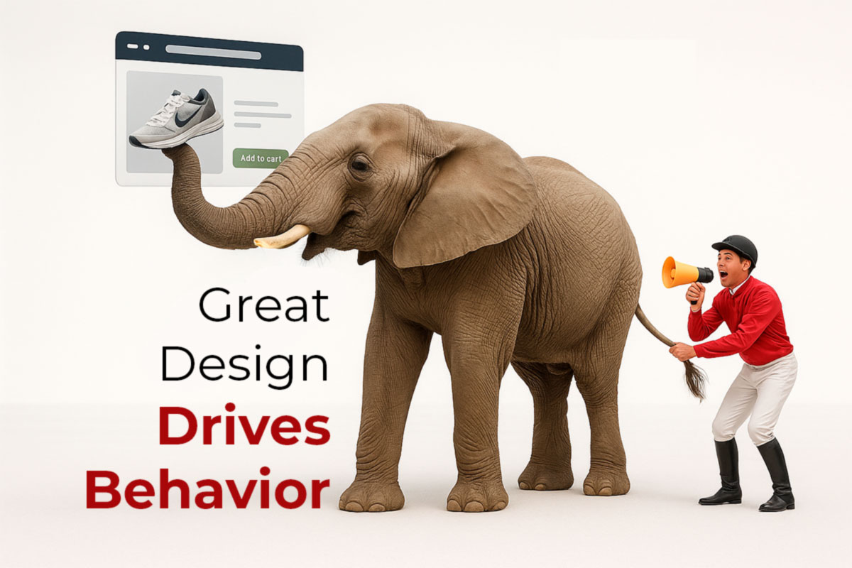
Jonathan Haidt captures it perfectly in The Righteous Mind: we are like a rider on top of an elephant. The rider thinks he’s in charge, guiding every step. But in truth, he’s just explaining the moves the elephant, our intuition, our emotion, already made.
And if that holds true in politics or ethics, it’s even more ruthless in UX. A poorly placed microcopy. A clunky animation. A button that hides in plain sight… and the elephant turns. Leaves. The user doesn’t complain. Doesn’t email support. They simply close the tab. And you never know why.
That’s why great design goes unnoticed, as the masters always said. Not because it’s dull or invisible, but because it doesn’t get in the way. It doesn’t demand effort. It doesn’t make noise.
Great design guides without pushing. Answers without asking. Supports without stealing the spotlight. It doesn’t scream for attention, but becomes the solid ground beneath every click. When it’s done right, the user doesn’t see it, they feel it. And when it’s wrong, they don’t see that either. They just sense a subtle friction. A pause. A break in the persuasive flow… and they’re gone.
Visionaries like Steve Jobs understood this when he said, “Design is not just what it looks like and feels like. Design is how it works.” Because good design, at its core, protects the most delicate part of human emotion: the urge to move forward without hesitation.
Design, then, is not just aesthetics. It is trust. It is speed. It is the silent emotion that translates intention into action, without ever needing to speak. It is persuasion at its most subtle and powerful.
2: The Friction You Never See
Every abandoned cart tells a story. But it’s not the one you think.
How many times have you double-checked everything, pricing, shipping, payment options, product descriptions, and still, conversions won’t budge? You match your competitors or even beat them… and yet the numbers stay flat. Sound familiar?
It’s easy to blame the obvious. But what really drives users away is quieter. A form that feels longer than it is. A button that doesn’t reassure. A tiny delay that makes the brain hesitate, just enough for doubt to sneak in.
These aren’t technical bugs. They’re emotional ones. Invisible snags that interrupt the user’s momentum without ever triggering an alert. They don’t crash the site. They don’t show up in analytics. But they stack. One soft “no” after another, until the user drifts away without a word.
In UX, friction isn’t just what slows people down. It’s what breaks their flow. And flow is fragile. When a user is in it, they don’t think, they glide. One click invites the next. Curiosity builds. Desire deepens. Until, suddenly, something breaks the rhythm: a field they don’t understand. A choice they didn’t expect. A pause that gives the rational brain time to interrupt the emotional one.
And that pause? That’s where the elephant hesitates.
People don’t abandon because they’re logical. They abandon because something didn’t feel right. And the worst part? They’ll never tell you. They won’t email. They won’t complain. They’ll just disappear, quietly.
3: Speed Is a Feeling, Not a Number
Ask any developer about site speed, and they’ll show you Lighthouse scores, milliseconds, and rendering times. But here’s the truth, speed is not just a metric. It’s a sensation. And like all sensations, it’s emotional.
Users don’t leave because a site takes 3.1 seconds instead of 2.9. They leave because it feels slow. Because something stalls their momentum. Because the page jitters, or nothing reacts when they tap. Because they’re unsure if something’s happening behind the scenes, or if the site simply forgot about them.
And here’s a second truth: the more complex an interface feels, the harder it becomes to trust. Every extra choice, every hesitation point, every awkward delay adds cognitive weight. It doesn’t just look cluttered, it feels uncomfortable. Heavy. Complicated.
It’s the digital equivalent of walking into a beautiful clothing store… that smells bad. The lighting is perfect. The products are premium. But something is off. And you just want to leave.
That’s why the fastest stores aren’t just fast, they feel effortless. They preload what matters. They give instant feedback. They design for rhythm and reassurance. They choreograph the journey so your mind doesn’t have to second-guess.
And it works. Because when users feel speed, they feel dopamine. It just feels good. Their brain rewards them for moving forward. Their intention continues in the flow. Their curiosity deepens. And they glide, click by click, toward conversion.
At Infinite Stair, we’ve helped clients close this perception gap, where just a week of UX tuning can reduce bounce rates, boost SEO, and raise conversions. Not by shaving milliseconds, but by engineering emotional momentum. Want your store to feel faster, not just be faster? Let’s talk.
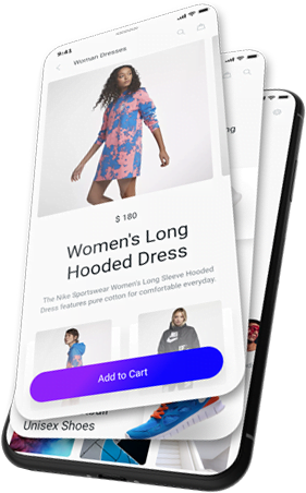
4: Cart Design Is a Psychological Journey
The cart and the checkout are not the same, and conflating them leads to design mistakes that cost conversions.
- The cart is emotional. It’s where users pause, review their decisions, and consider the total. It’s a place to feel in control.
- The checkout is technical. It’s where users hand over personal data and payment information. It’s where the stakes feel highest.
Great UX separates them clearly, and optimizes them differently.
Some stores reduce steps by skipping the cart entirely, using a “Buy Now” button that takes users straight from product page to checkout. That’s powerful for single-item purchases and mobile-first flows. But it limits upselling opportunities and average order value.
The smartest experiences offer both:
- A traditional cart to review and add more items
- A fast lane for repeat buyers or high-intent shoppers
This gives users the freedom to choose their own pace, and keeps the elephant moving forward.
Then comes the checkout, the most sensitive part of the journey. Every unnecessary field feels like friction. Every unanticipated step invites hesitation. While platforms like Shopify offer reliable checkouts, they come with guardrails that limit deep customization. For most brands, this works. But for those operating at scale, custom UX can unlock serious gains.
The best-performing checkouts are engineered like good conversations.
They:
- Ask only what’s needed, when it’s needed
- Pre-fill known information
- Sequence steps to match user intent
Think Amazon: first, your email (to save the session). Then, your address (to calculate shipping). Only then, payment. Each step feels logical. Light. Easy.
Bit by bit, the brain relaxes. The friction fades. The flow returns.
And that’s the secret: a great checkout disappears. All the user feels is progress.
5: Start Here – The UX Principles That Guarantee Better Conversion
You don’t need to be a developer to improve your store’s UX, but you do need to know what matters. Too many e-commerce owners obsess over color palettes and font pairings, while the real conversion killers go unnoticed.
Here are the non-negotiables every store manager should understand:
- Page speed is perception: It’s not just about loading in 2 seconds. It’s about feeling fast. That means using lazy loading for images, caching your assets, and eliminating anything that blocks first interaction.
- Feedback builds trust: When users click a button, they need to feel something happened. That’s what microinteractions do. A slight animation, a loading pulse, it tells the brain: “You’re in control.”
- Clarity beats cleverness: Every field on your checkout should have a clear label. Every button should say exactly what it does. Confusion is costly.
- Reduce effort everywhere: Use autofill. Predict addresses. Preselect sensible defaults. The less they type, the more they buy.
- Keep CTAs visible: Sticky “Add to Cart” or “Buy” buttons might feel aggressive, but they dramatically increase conversions. Out of sight, out of sale.
These aren’t nice-to-haves. They’re foundational. And you don’t need to implement them yourself, you just need to know they exist. Because when you work with UX experts, you’re not just paying for design, you’re investing in behavioral momentum that converts.
At Infinite Stair, we specialize in spotting what others miss. With just one week of focused UX tuning, we can surface quick wins, remove invisible blockers, and unlock the flow your store was built for.
Ready to see what your store is truly capable of? Let’s talk.
6: The Journey Starts Before Your Homepage
Conversion doesn’t start on your site, it starts much earlier. With the ad. The first scroll. The glimpse of a product in someone else’s cart. That’s when expectations begin to form. That’s when the emotional tone is set.
And here’s the part most brands overlook: consistency is the real driver of trust. Emotional consistency. Visual consistency. Message consistency. The promise your ad makes must match the tone of your landing page. The ease of your product page must echo in your checkout. The joy of unboxing should reinforce the reason they clicked in the first place.
When there’s a mismatch, between what they expect and what they experience, conversion drops. Not because users are picky, but because their emotional flow gets interrupted. And they start to second-guess.
That’s why we don’t just design pages. We design sequences. We align the entire journey, from first impression to final click, with how people feel, trust, and decide.
This is what we call the “Offer Flow”, a full-funnel sequence of contextual, relevant, low-friction moments that extend and deepen the buying experience:
Awareness (TOFU) – First impressions matter.
- Ads and landing pages that don’t just sell, but frame the problem emotionally
- Messaging that shows the user you understand their pain, before you pitch your product
- Visuals and tone that are consistent with the buying experience that follows
Consideration (MOFU) – Ease is persuasion.
- Product pages that highlight benefits over features
- Social proof placed right before objections arise
- Tools like interactive quizzes or bundling logic that reduce decision fatigue
Conversion (BOFU) – Flow is everything.
- A smart upsell before payment confirmation
- A checkout that feels effortless, predictive, even reassuring
- Options like “Buy now, decide later” to ease last-minute resistance
Loyalty – The relationship begins after the sale.
- A post-purchase add-on with one-tap acceptance
- A time-sensitive bonus if they refer a friend within 10 minutes
- A loyalty layer that starts at the thank-you screen, not weeks later
- Follow-up emails that don’t just push more products, but reflect the original promise
Sounds like a lot to get right? It is. But the hard part isn’t building the pieces, it’s integrating them seamlessly. Making every screen, every word, every delay or motion, part of a single, continuous, emotionally consistent experience.
That’s the real challenge. And that’s where most stores fail, not for lack of tools, but for lack of interaction design discipline.
7: Bonus Habit – Consistency Is the Real Conversion Engine
Most brands treat UX like a series of touchpoints. But the best-performing stores treat it like a symphony.
Every part, your ad, your product page, your cart, your emails, must play the same tune. Because users don’t just buy what you sell. They buy how it feels to buy from you.
And when that feeling changes, when the tone shifts, when the copy style breaks, when the flow stutters, trust takes a hit. Not because people notice, but because something inside them pulls back.
That’s why the brands that win in 2026 won’t just have better offers or better pages. They’ll have better alignment. Between promise and delivery. Between emotion and interface. Between what’s seen and what’s felt.
It’s not about designing more. It’s about removing friction across the whole experience, from scroll to sale to re-engagement. Because that’s what real UX is: not decoration, but design that carries emotion with precision.
Consistency, then, isn’t just a branding principle. It’s the operating system of conversion.
8: The Habits That Define the Next Generation of UX
These seven habits aren’t trends. They’re the new baseline.
- UX is emotion.
- Friction is invisible.
- Speed is a feeling.
- Cart and checkout are not the same.
- Principles first, UI second.
- The journey starts before your homepage.
- Consistency is the conversion engine.
Together, they form a new UX mindset, one that doesn’t just fix pages, but orchestrates behavior. One that builds stores not just for clicks, but for confidence. For flow. For emotional continuity from first touch to long-term loyalty.
Most brands won’t apply this. They’ll keep tweaking CTAs and running A/B tests without understanding why users drift away.
But you don’t have to.
At Infinite Stair, we audit e-commerce stores not just for broken UX, but for missed behavioral potential. In just one week, we’ll show you where emotion breaks, where conversions leak, and how to turn hesitation into momentum.Let’s make your UX your most powerful sales tool.
infinitestair.com/contact