

Make the Menu Guide the Purchase
How can an ecommerce menu help customers buy?
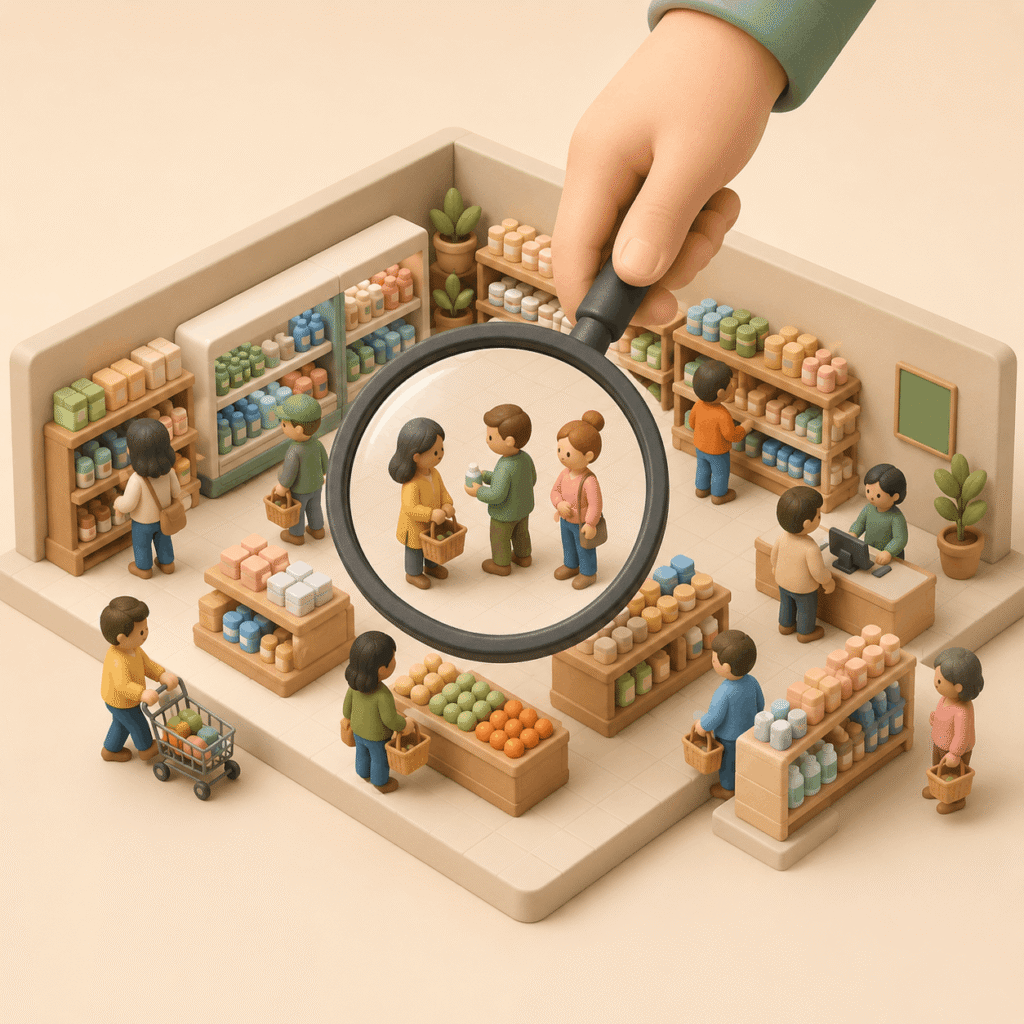
Good ecommerce navigation helps customers find products, understand options, and move toward purchase with fewer doubts.
Your store menu should not only show your inventory. It should work like a silent salesperson: it gives direction, explains paths, and helps customers reach the right product.
The goal is not to make the menu short or long. The goal is to make navigation match how people buy. A store with a few simple products may need a simple structure. A store with 300 products, technical products, or many similar options needs a clearer buying guide.
Start With the Customer Search
What should an online store understand before organizing categories?
Ecommerce taxonomy should start with customer search intent and the solution the customer needs to find.
Before creating menus, categories, or filters, your store needs to understand three things: what the customer is searching for, how they search for it, and what problem they need to solve.
A customer may know they want “running shoes,” but they may not know which brand to choose, why some shoes cost more, what other runners buy, or what type of shoe fits their level. This is where navigation starts selling: it turns a broad search into clearer buying paths.
Create Categories That Teach Customers How to Choose
How should ecommerce categories be organized to help customers choose?
Ecommerce category landing pages help explain differences, use cases, and buying criteria before showing products.
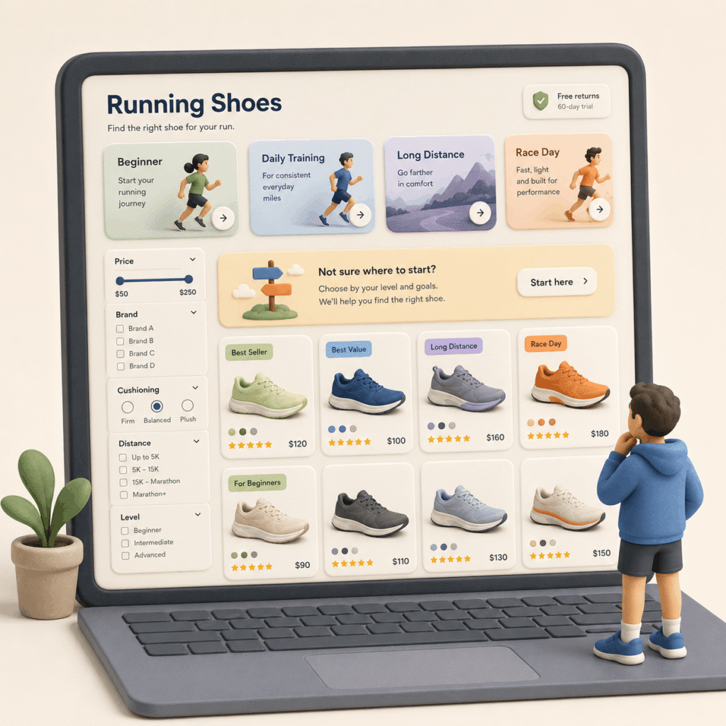
A category page should not be only a product grid. It can also teach customers how to choose. For example: “running shoes for beginners,” “running shoes for daily training,” “running shoes for long distance,” or “running shoes for race day.”
This makes it clear that not all running shoes do the same job. It also helps customers understand why some products cost more, which options are more technical, and which ones make sense for someone who is just starting.
Translate Inventory Into Customer Language
What is good ecommerce taxonomy?
Good ecommerce taxonomy connects technical product categories with real customer needs, search behavior, and comparison criteria.
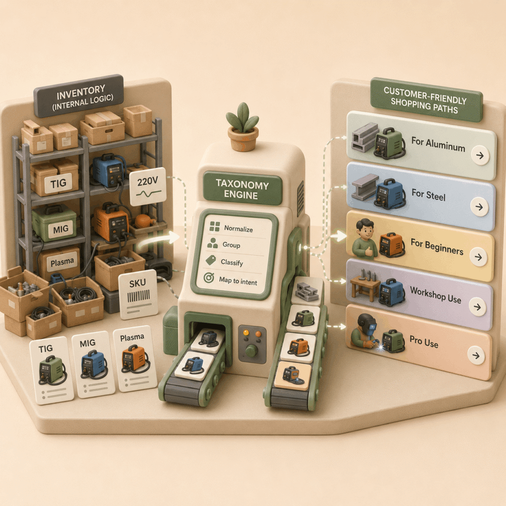
Taxonomy should not come only from your internal catalog. It should translate products into the way customers think and shop.
In a tools store, an expert may search for TIG, MIG, or plasma cutters. But another customer may search for “welder for aluminum,” “welder for steel,” or “welder for beginners.” A strong store connects both worlds: technical language and customer need.
Use Filters That Help Customers Decide
What filters does an online store need to help customers buy?
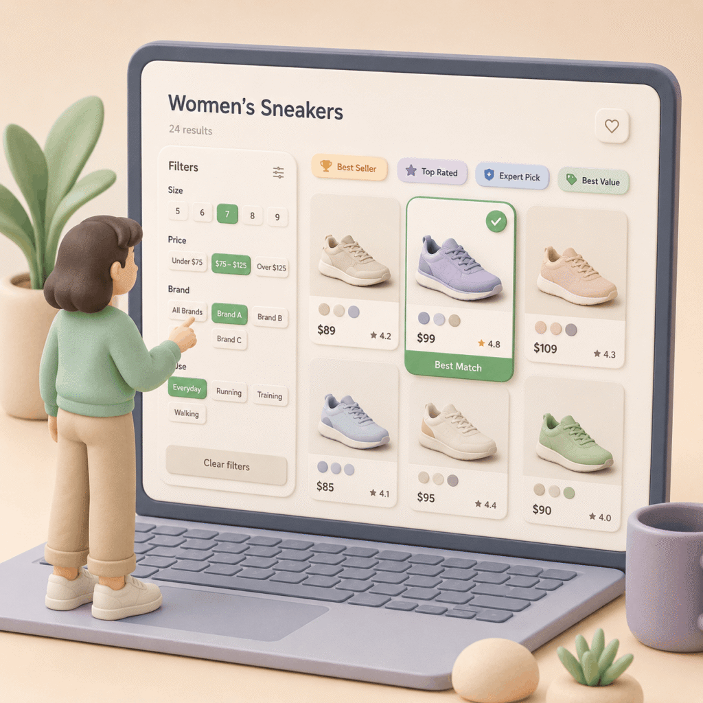
Ecommerce filters should show the data customers need to compare products and make a buying decision.
Filters are not an endless list of product attributes. They are decision tools. First, make sure customers have the basic data they need: size, price, brand, use case, compatibility, material, or experience level, depending on the category.
Then add signals that help them choose: best sellers, top rated, expert picks, best value, or recommended for beginners. You do not need every possible filter. The right balance depends on product complexity. Buying T-shirts is not the same as buying laptops.
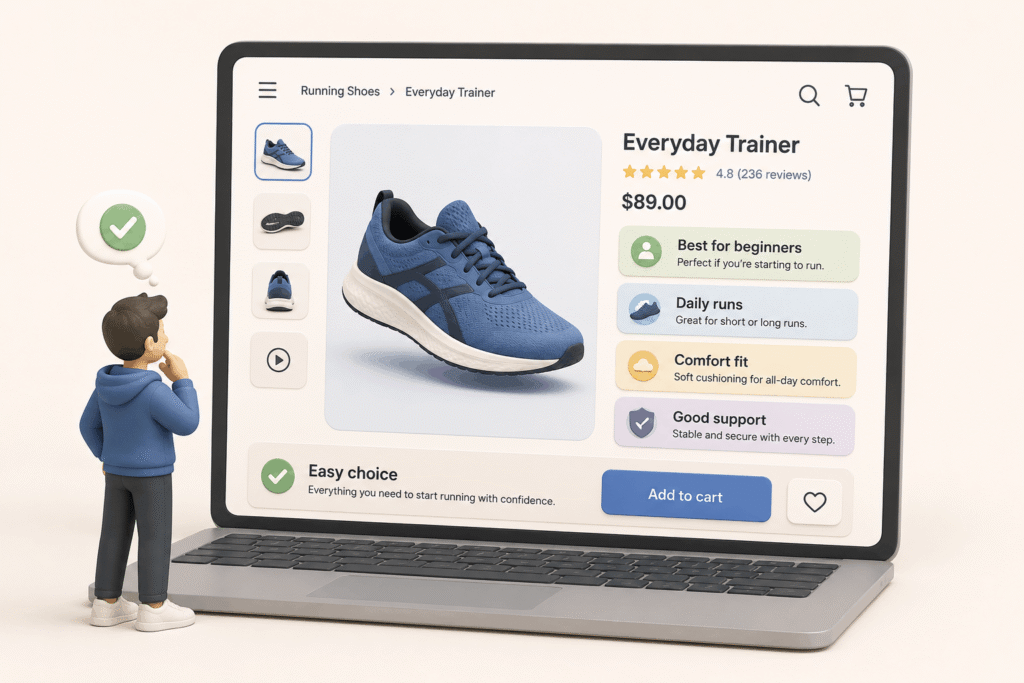
Let the Product Page Confirm the Choice
What should an ecommerce product page do?
An ecommerce product page should confirm whether the product fits the customer’s specific need.
The product page should not repeat generic information. It should close the doubt. If the customer arrived from “running shoes for beginners,” the product page should explain why this model works for someone who is starting to run.
A good product page answers: who it is for, when it makes sense, what problem it solves, what makes it different, and why it costs what it costs. Technical details matter, but they are not enough on their own. The customer needs to understand if the product makes sense for them.
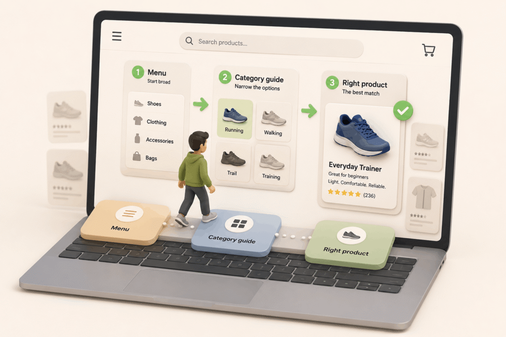
Make Every Click Move the Decision Forward
How many clicks should it take to find a product in ecommerce?
A clear ecommerce journey helps customers move from a broad search to the right product with less friction.
Solving the search in three clicks is a good target, but it should not be treated as a rigid rule. What matters is that each click makes sense and moves the customer closer to a better decision.
A clear path could be: menu, educational category page, and product page. Or internal search, filterable results, and the right product. If every step answers the customer’s next question, the store feels easier to use.
A good menu does not only show products. It helps customers understand their options, compare better, and reach the right product with fewer doubts.
Before reorganizing your store, review one important category and ask: Does this page help the customer decide, or does it only show products?
Rule to remember: A good menu does not organize products. It organizes decisions.