

How Motorola Increased Mobile Conversions by 53% with 3D Visualization
In late 2024, Motorola Latin America faced a challenge familiar to many e-commerce brands: improving online conversion rates on mobile devices. Online shoppers struggled to feel confident about products they couldn’t physically handle before purchasing, leading to high abandonment rates.
Motorola responded with a game-changing strategy, introducing advanced 3D product visualization across their mobile platforms in Argentina, Mexico, Chile, Colombia, and Peru. The results? Conversion rates surged by a remarkable 53.3% in Argentina and 47.2% in Mexico within just months (Semantic Scholar).
This success story isn’t isolated. In 2025, mobile-first optimization has become essential, not optional, as businesses aim to boost conversions and remain competitive. Here’s how your business can adopt these proven strategies to significantly increase mobile sales this year.
Why Mobile-First Optimization is Crucial in 2025
Mobile devices now account for over 60% of e-commerce traffic, and a massive 72% of online sales occur through smartphones (Shopify). Yet, mobile conversions continue to lag behind desktop rates, averaging around 2.9% compared to desktop’s 4.8% (Speedcommerce).
High cart abandonment rates reaching an alarming 85.65% highlight the need to remove friction from mobile shopping experiences (WordStream). Companies optimizing their mobile UX see dramatic improvements, often translating to millions in additional revenue.
Proven Mobile-First UX Strategies for Higher Conversions
3D Visualization and Augmented Reality (AR)
Motorola’s success with 3D visualization highlights the power of immersive mobile experiences. AR-powered product displays, especially in furniture, fashion, and eyewear, allow customers to virtually try before buying, significantly reducing hesitation and returns.
Action Tip:
Explore AR and 3D tools like Threekit or Augment to bring your products to life directly on your mobile platform.
Contextual Personalization
Mobile apps leveraging user data-location, browsing history, and time of day, offer tailored experiences, dramatically increasing user engagement and satisfaction (Semantic Scholar).
Action Tip:
Implement real-time personalization tools (like Dynamic Yield or Insider) to create uniquely relevant mobile shopping journeys.
Native Mobile Apps with Enhanced Security
Walmart Canada increased mobile orders by 98% with a native app strategy, emphasizing speed, security, and an optimized checkout experience (Blue Stout).
Action Tip:
Invest in native mobile apps rather than mobile-responsive websites. Prioritize secure, fast, and streamlined transactions to boost user confidence.
Practical Tips for Designing Mobile-First Experiences that Convert
To ensure your mobile-first strategy translates effectively into increased conversions, follow these design best practices:
1. Prioritize Thumb-Friendly Navigation
Most users browse and shop using one thumb. Place crucial buttons and interactions (like CTAs, menus, and search bars) in easy-to-reach areas, typically at the bottom-center of the screen.
2. Simplify Your Content
Mobile screens have limited real estate. Keep headlines short, descriptions concise, and product images optimized for quick loading. Clear messaging and minimal clutter significantly reduce bounce rates.
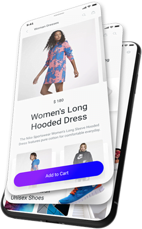
3. Optimize Product Pages for Vertical Scrolling
Design vertically oriented product pages with clear hierarchy:
- Product image at the top
- Price and critical product details immediately visible
- CTA buttons prominent and accessible without excessive scrolling
4. Use High-Quality Visuals (Optimized for Speed)
Invest in high-resolution, professionally shot product photos, but compress and optimize them using formats like WebP for faster loading without sacrificing visual quality.
5. Sticky CTAs and Simplified Checkout
Make the checkout process as frictionless as possible:
- Use “sticky” CTA buttons that remain visible during scrolling.
- Implement one-click payments, autofill, and guest checkouts to streamline transactions.
6. Clear, Easy-to-Read Typography
Select fonts and sizes that ensure readability on smaller screens. Use generous spacing and hierarchy to improve content scanning and comprehension.
7. Minimal Input Required
Reduce form fields and leverage dropdowns, autofill features, and predictive text inputs to minimize typing. Each removed step can dramatically increase conversions.
8. Consistent Omnichannel Experience
Ensure seamless continuity between mobile, desktop, and in-store experiences. Users should effortlessly transition between platforms, picking up where they left off.
Transform Your Conversions with Strategic A/B Testing
A/B testing, when done right, uncovers simple but powerful tweaks that significantly impact conversions. Consider these real-world examples:
- Clear Within boosted add-to-cart rates by 80% simply by moving their “Add to Cart” button above the fold (Shogun).
- T.M. Lewin increased conversions by 50% by clearly emphasizing their returns policy (Shogun).
- Swiss Gear improved holiday season conversions by an incredible 137% by optimizing their mobile product detail pages for clarity and simplicity (Shogun).
Action Tip:
Run targeted A/B tests focusing on critical mobile elements such as button placement, messaging clarity, and checkout simplification. Tools like Optimizely or VWO make this process straightforward and effective.
Mobile-First Redesign: When It’s the Right Move
Sometimes, iterative A/B testing isn’t enough. Comprehensive mobile-first redesigns can lead to significant breakthroughs:
- DV8 Fashion saw a 31% increase in mobile conversions immediately after their UX-focused redesign (IRP Commerce).
- A Scandiweb client boosted conversions by 92% through a strategic mobile-first redesign that optimized page loading speeds and overall UX (Scandiweb).
Action Tip:
If your site is outdated or conversions plateau, a mobile-first redesign prioritizing speed, usability, and user-centric elements might be your best growth investment.
Quick Wins to Boost Your Mobile Conversions This Quarter
To immediately see improvements in your mobile conversion rates, follow these steps:
- Speed Up Your Mobile Site
Each second of delay can cut conversions by 20%. Optimize images, leverage caching, and simplify your design for faster loads (Think with Google). - Simplify the Checkout Experience
Reduce form fields, offer guest checkout, and prominently display secure payment methods. Reducing friction here can boost mobile conversions up to 35% (Keap). - Continuously Test and Learn
Run frequent A/B tests on key pages and checkout processes. Make decisions based on real user behavior, not assumptions.
What’s Next?
Are you leveraging mobile-first strategies in your e-commerce store?
Have you seen significant improvements from A/B tests or mobile redesigns?
At Infinite Stair LLC, we specialize in helping e-commerce brands drive conversions through strategic, data-driven UX optimization. Whether you’re starting fresh or refining your mobile strategy, we’d love to hear your experiences.
Let’s build high-converting mobile e-commerce experiences, together.
References:
- Semantic Scholar – Motorola 3D Visualization Study
- Shopify CRO Statistics 2025
- Speedcommerce E-commerce Benchmarks 2025
- WordStream CRO Stats 2025
- Blue Stout Walmart Canada Mobile Case Study
- Shogun E-commerce A/B Testing Case Studies
- IRP Commerce DV8 Case Study
- Scandiweb Mobile Conversion Case Study
- Think with Google Mobile Speed Report
- Keap Mobile Checkout Optimization