Make buying easier to finish
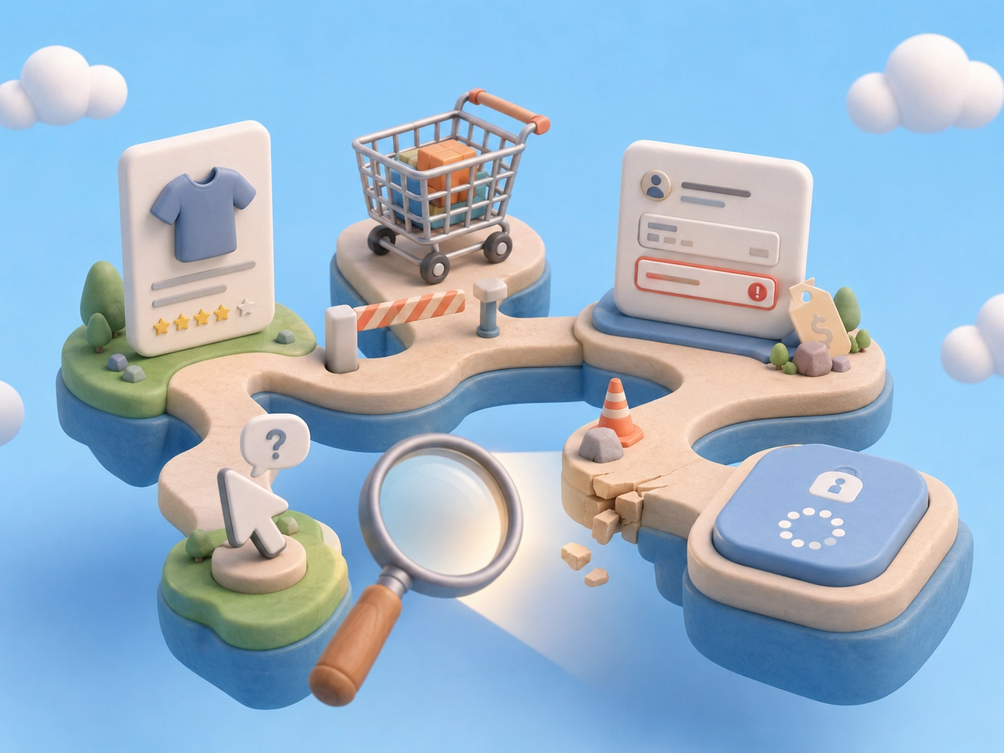
What is ecommerce friction?
Ecommerce friction happens when usability, content, performance, or checkout problems make customers work harder to complete a purchase.
Ecommerce friction is any moment where buying becomes harder than it should be.
It can happen when a customer has to stop, think too much, wait too long, repeat an action, fix an error, or search for missing information before completing a purchase.
The problem is that friction does not always look dramatic. It can be a slow product page, an unclear size guide, a hidden shipping cost, a confusing cart, a weak return policy, or a payment button that does not clearly respond after being clicked.
In simple terms: Friction is anything that interrupts the customer’s buying momentum.
That friction can be psychological, like doubt or lack of trust. It can be architectural, like a confusing checkout flow. Or it can be technical, like a slow page, broken button, or poor mobile experience.
For a small ecommerce team, the key lesson is this: Do not only ask, “Does the store look good?” Ask, “Does the store help customers keep moving toward the purchase?”
Look for customer struggle
How do I know if my online store has friction?
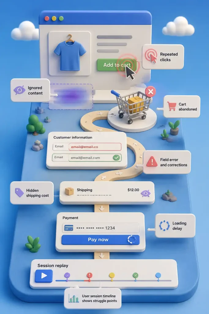
A usability analysis helps ecommerce teams detect repeated clicks, checkout drop-offs, form errors, exits, and hesitation before guessing what to redesign.
Ecommerce friction is easier to find when you stop judging the store by how it looks and start watching how customers behave.
Customers usually show friction through small signals: they click again, scroll without choosing, leave a form unfinished, return to the cart, abandon checkout, or ask support a question the site should have answered.
The most common signs are rage clicks, dead clicks, checkout drop-offs, form returns, and repeated questions about product details, shipping, returns, discounts, or payment.
These signals matter because they show where the customer is trying to move forward but gets slowed down.
A useful usability analysis starts there: not with a redesign idea, but with the moments where customers hesitate, repeat, correct, or leave.
Follow the buying path
Where should I look for ecommerce UX issues first?
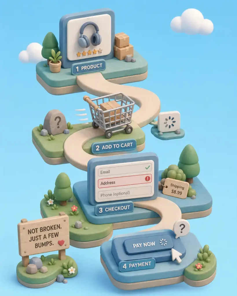
The most common ecommerce UX issues usually appear in product discovery, product pages, cart, checkout, payment, mobile experience, and site speed.
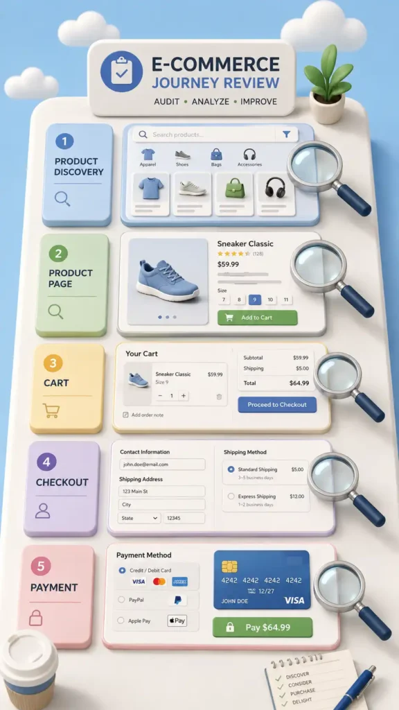
To find ecommerce friction, review the store in the same order a customer uses it.
Start with product discovery. Can customers find what they are looking for through search, categories, filters, or menus?
Then review the product page. Can they understand the product, compare options, choose the right variant, check delivery details, and trust the purchase?
Next, check the cart. Are totals, discounts, shipping, taxes, and next steps clear before checkout?
Then review checkout and payment. Can customers complete the purchase without unnecessary fields, forced account creation, confusing errors, or payment doubts?
Finally, test the mobile experience. A flow that feels acceptable on desktop can become frustrating on a smaller screen.
This section should answer one thing: where in the buying path is the customer most likely to slow down or leave?
Use the right evidence
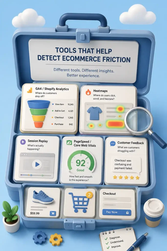
What tools help detect ecommerce friction?
GA4, Shopify Analytics, Microsoft Clarity, heatmaps, session recordings, PageSpeed Insights, and customer feedback help ecommerce teams measure conversion friction more clearly.
To find ecommerce friction, you need two types of evidence: numbers and behavior.
Numbers show where the problem happens. Behavior shows what the customer was doing when the problem appeared.
Different tools answer different questions.
Use GA4 or Shopify Analytics to find drop-offs in traffic, product views, cart, checkout, and purchase completion.
Use Microsoft Clarity, Hotjar, Mouseflow, or similar tools to review heatmaps, scroll maps, session recordings, rage clicks, and dead clicks.
Use PageSpeed Insights and Core Web Vitals to check if slow loading, delayed interaction, or layout instability is hurting the experience.
Use customer feedback, support tickets, reviews, and surveys to find doubts the site is not answering.
The point is not to use every tool. The point is to connect the right signal with the right question before deciding what to fix.
Protect the final step
How can I measure checkout friction?
Checkout friction is one of the most important ecommerce usability problems because it affects cart abandonment, payment completion, and final conversion.
Checkout is the moment where friction becomes expensive. The customer already found a product, added it to the cart, and showed purchase intent.
Look for problems that make the final step feel longer, riskier, or less clear: forced account creation, too many form fields, hidden shipping costs, unclear payment options, discount code confusion, weak error messages, or missing order summaries.
To measure checkout friction, review where customers leave inside the checkout flow. Check cart-to-checkout rate, checkout-to-payment rate, payment errors, discount code errors, form corrections, and exits after shipping or tax appears.
Then fix the blockers first. Make guest checkout visible, reduce unnecessary fields, show costs earlier, explain errors clearly, keep the order summary visible, and make payment options easy to recognize.
Checkout is not the place to impress the customer. It is the place to help them finish.
Make mobile buying feel faster
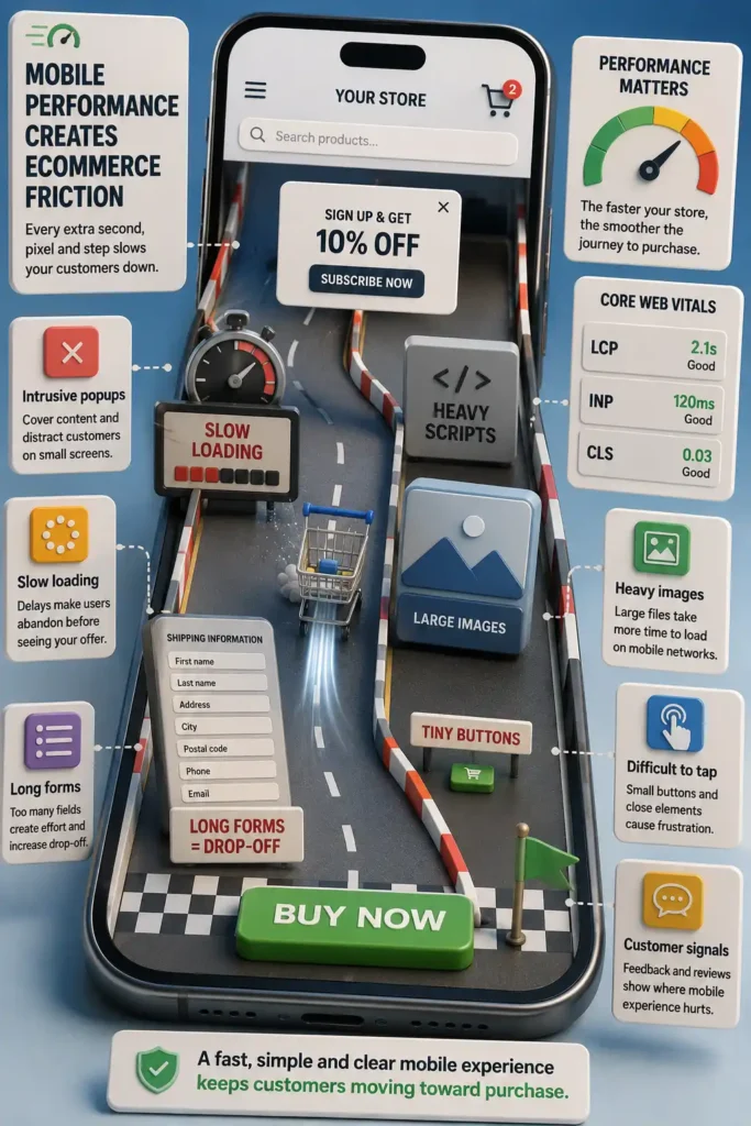
How does mobile performance create ecommerce friction?
Mobile ecommerce usability depends on fast pages, clear tap targets, simple forms, correct keyboards, and strong Core Web Vitals performance.
Mobile friction appears faster because customers have less space, less patience, and less precision.
A product page may look fine on desktop, but feel heavy on a phone. Buttons can become hard to tap. Filters can become annoying. Forms can feel endless. Popups can block the screen. A slow response after clicking «Add to Cart» can make the customer wonder if the store worked.
Measure this by comparing mobile conversion against desktop conversion. Review mobile recordings, tap behavior, form exits, page speed, Core Web Vitals, and INP, which measures how quickly the page responds after a user interaction.
To reduce mobile friction, simplify forms, improve page speed, compress images, remove unnecessary scripts, use larger tap targets, and make sure each field opens the right keyboard.
Mobile buying should feel quick, clear, and easy to complete.

Test small before you build big
How can I test ecommerce improvements before redesigning the whole store?
Lean UX helps validate ecommerce improvements with simple prototypes before investing in development.
When you find a problem, do not rush into redesigning the whole store. First, create a simple hypothesis: “If we organize products by age, customers will find what they need faster.”
Then test that idea with something small: a sketch, a new section, a simple landing page, or a test with a few users. It is cheaper to correct an idea early than to fix a full redesign later.
Fix blockers before polish
What ecommerce friction should I fix first, and who should fix it?
The best ecommerce usability improvements prioritize issues that block checkout, reduce trust, slow mobile users, or make product decisions unclear.
Not every friction point deserves the same attention.
Start with the problems closest to the sale: checkout errors, payment problems, hidden costs, missing product information, mobile friction, and trust gaps. These are the issues most likely to affect conversion directly.
Then separate problems into three groups: blockers, high-impact improvements, and polish.
Blockers stop customers from buying. A broken payment method, a confusing checkout error, or a product page without key information belongs here.
High-impact improvements make buying easier. This includes clearer shipping details, better product descriptions, simpler forms, stronger trust signals, and faster mobile pages.
Polish improves the experience, but does not remove a major obstacle. Visual refinements, small layout adjustments, or secondary design details can wait until the main friction points are fixed.
The rule is simple: fix what blocks the sale before improving what only makes the store look better.
Who should fix ecommerce usability problems?
A usability problem is not always a design problem.
Sometimes the issue is technical. Sometimes the product content is unclear. Sometimes the checkout flow is confusing. Sometimes the shipping policy creates doubt. Sometimes customer service is answering the same question because the website does not explain it well.
Assign each friction point to the right owner.
The ecommerce manager should prioritize the problem and connect it to conversion. The UX/UI designer should improve layout, hierarchy, flow, and interaction. The developer should fix bugs, performance, tracking, and checkout behavior. The marketing or content team should clarify product information, offers, and messages. The operations team should clarify shipping, returns, stock, and fulfillment details. The customer service team should report repeated questions and complaints.
The goal is to avoid vague tasks like «improve the website». A better task is specific: «make guest checkout visible», «show delivery estimates before checkout», or «fix the mobile add-to-cart delay».